
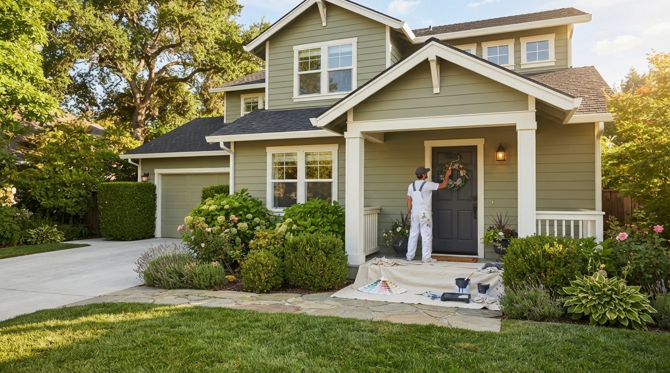
Exterior Paint Colors That Boost Curb Appeal in 2026
Choose exterior paint colors that boost curb appeal with confidence. Call (833)-700-4293 to compare local painting pros and get free quotes.

By Claire Foster
Learn more about Exterior Painting for guides, costs, and what to expect.
Compare Exterior Painting Pros Near You

Enter your ZIP code to compare top-rated local professionals and request free quotes.
A fresh coat of exterior paint is one of the highest-return updates a homeowner can make, and the color you choose does more than protect siding from sun, rain, and temperature swings. It shapes first impressions, signals how well the home has been maintained, and can even influence how quickly a property sells. Choosing exterior paint colors that boost curb appeal, however, is not as simple as picking a trendy shade from a magazine. The right color depends on your home's architecture, the fixed elements you cannot easily change (roof, brick, stone, driveway), and the lighting conditions of your region.
This guide walks through proven color families, pairing strategies, and regional considerations so you can move from inspiration to a confident decision. It also covers how to translate a color idea into a real project, including how to find a qualified painting professional when the prep work, repairs, or height of your home make a DIY approach impractical.
Why Exterior Color Matters More Than Most Homeowners Realize
Exterior paint performs two jobs at once. It is a protective layer that shields siding, trim, and wood from moisture intrusion, UV fading, and freeze-thaw cycles. It is also the single largest visual element of your home's facade, covering far more surface area than the front door, shutters, or landscaping combined. That combination of function and visibility is why paint consistently ranks among the most cost-effective exterior improvements.
Color also carries psychological weight. Warm neutrals tend to read as welcoming and established, while deep charcoals and slate blues suggest modern confidence. Bright, saturated hues can make a smaller home feel playful and distinctive, but they can also date quickly or clash with neighboring properties in a tight subdivision. Understanding these signals helps you choose a palette that feels intentional rather than accidental.
There is a practical real estate angle as well. Buyers form an opinion within seconds of pulling up to a home, and exterior condition is one of the first things they evaluate. A peeling or faded facade raises questions about deferred maintenance inside. A crisp, well-chosen palette does the opposite: it communicates care and can justify a higher asking price. If you are planning to sell within a few years, sticking with broadly appealing colors usually outperforms a bold personal statement.
The Exterior Paint Colors That Boost Curb Appeal Most Reliably
Certain color families have earned their reputation because they work across many architectural styles and regions. The following categories are not trends; they are durable choices that have performed well for decades and continue to dominate exterior design in 2026.
- Warm whites and creams: Soft, slightly yellow or beige whites flatter brick, stone, and wood trim without the harsh glare of pure white.
- Greige and warm gray: A blend of gray and beige that pairs equally well with dark roofs and light trim.
- Earthy greens: Sage, olive, and muted forest tones connect a home to its landscape and hide dust well.
- Navy and slate blue: Deep, cool tones that add sophistication and contrast beautifully with white trim.
- Charcoal and soft black: Modern, dramatic choices best suited to contemporary or farmhouse architecture.
Each of these families can be adjusted lighter or darker depending on your home's exposure. A north-facing wall receives indirect light all day, which makes colors appear cooler and slightly darker. South-facing walls get strong direct sun that washes out pale shades and intensifies warm ones. Always test a sample on at least two sides of the house before committing.
It also helps to think in terms of a three-color system: a dominant body color, a secondary trim color, and an accent for the front door, shutters, or gables. Most successful exteriors follow a roughly 60-30-10 distribution. Deviating from that balance is possible, but it requires a strong design eye and careful testing.
Matching Paint to Your Home's Architecture and Fixed Features
Your roof, brick, stone, and driveway are expensive to change, so they should drive the palette rather than compete with it. Start by identifying the undertones in those fixed elements. A roof with brown or taupe shingles calls for warm body colors. A cool gray or black roof pairs naturally with cooler grays, blues, and crisp whites. Brick with red or orange undertones can clash badly with pinkish beiges, so lean toward greens, deep blues, or warm grays instead.
Architectural style adds another layer. Colonial and traditional homes tend to look best with classic palettes: white or cream siding, dark shutters, and a contrasting door. Craftsman bungalows shine with earthy greens, browns, and muted golds that echo natural wood. Modern and contemporary homes can carry monochromatic schemes in charcoal, slate, or off-white with minimal trim contrast. Farmhouse styles often use white or light gray body colors with black window frames and a natural wood or colored door.
If you are unsure where to start, photograph your home in daylight and pull the image into a free color visualizer. Most major paint brands offer tools that let you upload a photo and test shades on your actual facade. This step costs nothing and prevents expensive mistakes. Once you narrow to two or three candidates, buy sample pots and paint large swatches directly on the siding, then observe them at morning, midday, and evening.
Regional Light and Climate: Why the Same Color Looks Different
Sunlight intensity, humidity, and surrounding landscape vary dramatically across the United States, and those factors change how a paint color reads. In the Pacific Northwest, where skies are often overcast, colors appear cooler and more muted, so homeowners there frequently choose warmer whites and greens to counteract the gray light. In the Southwest, intense sun bleaches pale colors quickly and makes dark colors absorb heat, so lighter, heat-reflective tones are both more comfortable and longer lasting.
Humidity matters too. Coastal homes face salt air and moisture, which can break down lower-quality paints faster. In those environments, a high-quality exterior formula with mildew resistance is worth the extra cost regardless of color. In cold climates, freeze-thaw cycles stress paint films, so proper surface preparation and flexible, high-grade coatings matter more than the specific shade.
Neighboring homes also influence perception. If every house on your street is beige, a deep navy can feel bold and refreshing; if the street is already a patchwork of strong colors, a calm neutral may be the most striking choice. Walking your block and noting recurring palettes helps you decide whether to harmonize or stand out.
Choosing Trim, Doors, and Accents to Complete the Look
The body color gets the attention, but trim and accents determine whether the final result looks polished. A general rule is to choose trim that contrasts with the body by at least two to three shades in either direction. White trim on a mid-tone body is the safest combination and works on nearly any style. Dark trim on a light body creates a more modern, graphic look and is increasingly popular on contemporary and farmhouse homes.
The front door is your accent opportunity. It can be the one place where you introduce a saturated color: a red, teal, mustard, or deep aubergine that would overwhelm the entire house but sings in a small area. Shutters, garage doors, and porch railings can either repeat the trim color or pick up the accent, depending on how much visual rhythm you want.
Do not overlook the garage door. On many homes it occupies a large share of the facade, and painting it the same color as the siding helps it recede, while matching it to the trim makes it a feature. Whichever approach you take, keep the total number of colors to three or four. Beyond that, exteriors start to look busy rather than designed.
Sheen, Finish, and Practical Durability
Color is only part of the specification. Sheen affects both appearance and performance. Flat and matte finishes hide surface imperfections well and are common on siding, but they are harder to clean. Satin and eggshell offer a slight sheen that resists dirt and moisture, making them a good middle ground for siding in humid or dusty areas. Semi-gloss and gloss are reserved for trim, doors, and shutters because they are durable, easy to wipe down, and reflect light in a way that highlights architectural details.
Higher sheen also makes touch-ups more visible, so if you expect to patch small areas over time, a flatter finish on large surfaces is more forgiving. Quality matters as much as color: a premium exterior paint with UV inhibitors and mildewcide will hold its color far longer than a budget product, especially on south- and west-facing walls that take the most sun.
Preparation is the invisible factor that determines how long your new color lasts. Washing, scraping, sanding, priming bare wood, and caulking gaps are not glamorous, but skipping them leads to peeling within a few seasons. If your home has multiple stories, deteriorated siding, or lead-based paint (common in homes built before 1978), this is work best handled by a professional crew with the right equipment and safety training.
From Color Choice to Finished Project: Finding the Right Painter
Once you have your palette, the next step is turning it into a completed exterior. A full repaint typically involves power washing, surface repairs, priming, caulking, masking, and two coats of finish, plus careful protection of landscaping, windows, and driveways. Doing this safely at height, in heat, or around lead paint is risky for an inexperienced homeowner, and mistakes in prep can cost more to fix than the original job.
This is where a vetted local professional makes a real difference. A reliable painter will help you confirm your color choices, recommend the right sheen for each surface, and prepare the substrate correctly so the finish lasts. To find one, request quotes from multiple contractors, ask for references on similar homes, verify insurance and licensing, and get the scope of work in writing, including the number of coats, the specific paint brand and product line, and the warranty terms.
If you would rather not cold-call painters or chase down references yourself, a free quote platform can streamline the process. FreeQuotes.Contractors connects homeowners in the United States with pre-vetted local contractors for painting and other home improvement projects, letting you compare competitive bids for your exterior repaint without paying for the service. Because exterior painting is seasonal in most regions, starting your search a few weeks before you want the work done gives you more choice and better scheduling flexibility.
Common Mistakes That Undermine Curb Appeal
Even homeowners who pick a great color can end up disappointed if they overlook a few classic pitfalls. The most common is choosing a shade from a tiny paint chip instead of testing it at scale on the actual house. Colors shift dramatically between the store, the sample card, and full sun on siding. Another frequent error is ignoring the roof and brick undertones, which can make an otherwise attractive color look muddy or clashing.
A third mistake is overdoing contrast. Too many strong colors on trim, shutters, doors, and garage doors create visual noise. A fourth is neglecting the sheen plan, using the same finish everywhere and losing the subtle depth that distinguishes a professional job. Finally, many homeowners underestimate prep time and budget, then rush the coating stage, which shortens the life of the paint.
Avoiding these issues is mostly about sequencing: choose colors that harmonize with fixed features, test samples in real light, define a three-color system, match sheen to surface, and invest in thorough preparation. Do those things and your exterior will look intentional for years, not just for one season.
Quick Reference: High-Impact Palette Combinations
If you want a starting point rather than a blank canvas, these combinations are widely tested and adaptable across styles:
- Warm white body, soft gray trim, navy front door (classic and broadly appealing).
- Greige body, white trim, charcoal shutters (modern traditional).
- Sage green body, cream trim, natural wood door (Craftsman and bungalow).
- Slate blue body, white trim, black door (coastal and colonial).
- Charcoal body, white trim, natural wood accents (contemporary and farmhouse).
Treat these as frameworks, not formulas. Adjust the exact shade to your roof, brick, and regional light, and always confirm with large on-site samples. A palette that looks perfect in a photo may read entirely differently on your street.
The best exterior color is ultimately the one that protects your home, fits its architecture, and makes you smile every time you pull into the driveway. With a clear understanding of how color interacts with light, materials, and style, you can choose with confidence, then hand the prep and application to a trusted professional so the result lasts. Whether you tackle the project this season or plan it for next spring, the effort you put into selecting the right palette will pay off in both pride and property value.